Information design is the practice of presenting information in a way that fosters an efficient and effective understanding of the information. The term has come to be used for a specific area of graphic design related to displaying information effectively, rather than just attractively or for artistic expression.
I played a lot of DungeonQuest back in the day, and then got the third edition much later when Fantasy Flight reprinted it. It plays out in a classic fantasy dungeon-crawl setting. A fun overall game where you die a lot, no matter what edition you play! Yet there were some changes that didn't work well in the new edition. One of which was in the information design regarding the shape of cards.
In DungeonQuest there are a lot of different card piles to shuffle and draw from and put cards into the discard piles of. What they did well in the original edition was to make all the cards different interesting shapes.
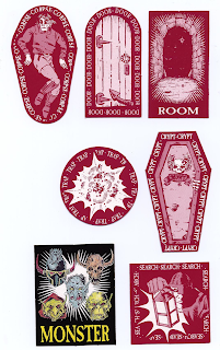 |
| Cards from the original edition of DungeonQuest. |
At first it seems like over elaborate theming. But when you compare the play experience to the Fantasy Flight third edition, where all the cards are differentiated by just an image on the back, you realize the shapes in the original edition serve an important function: they let you know by shape where each card goes back to. This is less relevant when drawing, since you see where it is coming from (but still a little relevant since the shape reinforces the game "function") but it is hugely relevant when you need to know where to discard the card to.
 |
| DunegonQuest third edition. All cards in a row there are the same shape. Different shapes would have helped identify them. |
In the third edition, when it comes time to discard a card, you look at it, try to see if you can guess which pile it came from, don't usually succeed since there is a lot of overlap in the game content in each deck, then flip the card over to check the back, scan the eight piles of cards to see if the image matches any of them (those murky images didn't help either but that's for another day), and then discard it to the right pile. At the end of the game, you have to check all the piles to see if any cards were mis-discarded, which is often the case, and them put them in the right piles. This never happened in the first edition, since the unique shape lets you know instantly where it gets discarded.
Both editions used shape and size to differentiate the character cards from the rest of the cards though, so it was easy to visually pick them out on the table amidst all the other things.
 |
| Character card from the third edition of DungeonQuest. Larger than other cards, also oriented sideways relative to them. Makes it stand out. |
 | |||
| Character Card from the original edition of DungeonQuest. Long and thin and larger than the other cards, so it is easier to visually find. |
So why does this matter? Because you want a player to be involved in the core aspects of your game, such as the strategic choices, or the imaginative immersion, or the flow of the experience, or the social experience, or whatever your goals for the game are, instead of focusing on the "interface", which in board games is highly connected to information design, as well as rules clarity, game mechanics, and ergonomics.
The less a player has to struggle with, or pay attention to, the "interface", the more they can play the game.
This is part 2 of a 3 part series. Read part 1, about size in information design, here. Or continue to part 3, here.