Information design is the practice of presenting information in a way that fosters an efficient and effective understanding of the information. The term has come to be used for a specific area of graphic design related to displaying information effectively, rather than just attractively or for artistic expression.
In my previous posts about information design in board games, I talked about the significance of component size and the use of shapes to convey information. This time, I'll talk about the often underestimated yet crucial element of layout, and how thoughtful layout choices can convey information effectively. The layout of text and graphics on a game component can make a huge difference in how players interpret and interact with the game.
The Hierarchy of Information
Much like in a book or a web page, the layout of information in a board game should establish a hierarchy. This hierarchy guides players' attention and understanding. Typically, more important or frequently referenced information is placed prominently, while secondary or context-specific details are presented in a less prominent manner.
Example 1: Ticket to Ride
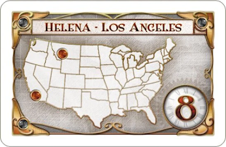
In Ticket to Ride layout communicates essential information. Destination tickets showcase the points awarded for completion prominently at the bottom right, with the cities the player needs to connect as the title. The point value is made more prominent on the card by making it the largest element, and by offsetting it in its own circle - which brings it into the foreground, making it look like it is set on top of the rest the background, instead of integrated with it. The cities of the route are also important and the rest of the card information is dedicated to those. This layout encourages players to prioritize the point values of the routes, and then figure out where those are on the map.
Clarity and Readability
A fundamental principle of information design is readability. Readability hinges on clear fonts, sufficient contrast, and appropriate spacing. The goal is to make text and graphics easily legible to all players.
Example 2: Carcassonne
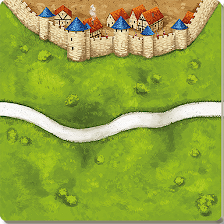
Carcassonne's tile layout is a great example of readability. The city, road, and field sections are crisply defined and intuitively designed, making it simple to recognize the type of feature and its potential connections. The ease of readability encourages quick and accurate tile placement.
Example 3: Codenames
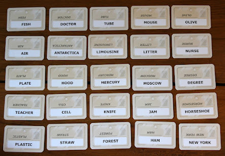
In Codenames, the word cards' layout is designed for readability. The words are presented in a grid, ensuring they are easy to see from across the table. This lets players quickly scan the words and make word-association connections with their team. Also, the words are printed twice on each card, so that the words can be read right side up from either side of the table.
Information Grouping
In board games, effective layout often groups related information together. This approach reduces visual clutter and supports quick comprehension of complex concepts.
Example 4: Power Grid
Power Grid's power plant cards use information grouping simply, but well. Essential details like the power plant's resource type, capacity, and fuel cost are neatly clustered together along the bottom, in front of a background color bar. This layout allows players to evaluate the power plant's value efficiently and more easily make informed decisions. The big number in the top left of the card is separate from the other icons, since it is referenced at a different time and in a different way - in order to determine when the card comes into the for sale queue as well as a minimum bid.
Some things to avoid
Bad layouts in board games often cause confusion, hinder game play, or compromise the overall experience. Here are some common elements of bad layout:
Overcrowding: When there's too much information or components crammed into a small space, it can lead to visual clutter. This makes it challenging for players to interpret the game state. A cluttered board can confuse players and slow down the game.
Unclear Text or Icons: If the text is too small, fonts are difficult to read, or icons are unclear, players may struggle to understand the rules or components. This can lead to constant rule-book referencing and frustration.
Inconsistent Visuals: Inconsistent graphic design, color schemes, or iconography can confuse players. When similar elements have different meanings or when the same meanings are represented differently, it can hinder understanding.
Conclusion: Layout in Board Games
Effective layout design in a board game is essential for creating a smooth, enjoyable, and immersive gaming experience, and poor layout can detract from the overall enjoyment of the game. From establishing hierarchies and readability to grouping related information, effective layout helps players understand the game and make strategic decisions more easily.
The next time you sit down to play a board game, take a moment to notice how the layout impacts your gaming experience.
Read Part 1: Size or Part 2: Shape of this series.
More posts about Information Design.
More posts about Game Design.


