Indentations from the left justification line cause a pause in the flow of the reading. That is why new paragraphs are started that way. An empty line between text lines also causes a pause. You don't want a pause in the middle of your sentences or paragraphs.
Here are some good examples of left-justified text:
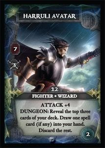
 Thunderstone Advance card. They fixed the text alignment! (See old card in bad examples below.) I don't like other things about this card, but that's another blog entry.
 Older Thunderstone card.
 A card from Mage Knight. That game has enough going on! It would be a little easier to process if the card text was left justified. I think it is a great game, despite layout flaws.
 From Smash Up. This card suffers from many other mistakes I will cover in other blog entries, including hard to read fonts, lack of whitespace, and full bleed graphics (usually a flaw, really, the way it is done).

